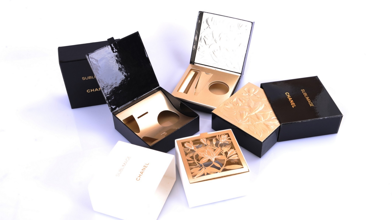
rigid box display design

Displayable Packaging: How Your Lingerie Gift Box Becomes a Showcase?

In the luxury retail market, the first impression begins at the shelf. Traditionally, packaging served only to protect the delicate contents inside. However, modern brands now demand more functionality from their high-end containers. A premium rigid box display design can transform into a stunning retail display stand instantly. This guide explores the design secrets of multi-functional lingerie packaging. We help you turn a simple gift box into a silent, high-performance salesperson.

1. The Design Philosophy: From Protection to Presentation

Innovative engineering allows a box to serve two purposes without extra cost.

The “Open-to-Display” Concept

Some designs allow the lid to fold back into a supportive base. Consequently, the rigid box stands upright on any flat retail surface. This structure invites customers to touch and feel the fabric quality immediately. Furthermore, it eliminates the need for expensive third-party acrylic display racks. Therefore, you save space while maintaining a high-end brand image.

Transparent Windows for Instant Impact

Strategic cut-outs allow the product to shine without opening the seal. Consequently, shoppers can appreciate the lace or silk textures from a distance. Furthermore, clear windows protect the delicate items from dust and fingerprints. This maintains the “pristine” look required for luxury intimate apparel. Therefore, your packaging acts as a protective shield and a visual magnet.

2. Retail Applications: Maximizing Shelf Real Estate

A well-designed box optimizes every square inch of the physical store environment.

Seamless Shelf Arrangements

Standard boxes often hide the beauty of the product they contain. In contrast, displayable packaging makes the box the center of attention. Consequently, your brand stands out in a crowded multi-label boutique. Furthermore, the sturdy nature of a rigid box allows for safe, vertical stacking. This creates a clean and organized visual flow for the consumer.

Impulse Buys at the Checkout Counter

Compact, display-ready boxes are perfect for high-traffic “point of sale” areas. Their attractive design triggers an emotional response in shoppers waiting in line. Consequently, you can increase your average transaction value with small gift sets. Therefore, treat your packaging as a dynamic tool for driving unplanned sales.

3. Advice for Retailers: Packaging is Your Best Guide

Modern consumers view the box as a reflection of the product’s true value.

  • Choose Magnetic Closures: These provide a satisfying “snap” and a premium feel.

  • Prioritize Sustainable Paper: Use eco-friendly luxury papers to align with modern values.

  • Customize the Inner Tray: Ensure the insert holds the lingerie in a perfect shape.

Consequently, you build trust with the customer before they even use the product. A rigid box display design justifies a higher price point for your luxury line. Furthermore, it encourages customers to reuse the box as a home storage solution. Therefore, the brand remains in the customer’s home long after the initial purchase.

Conclusion: Redefining the Luxury Unboxing Experience

Luxury is about the details that other brands often choose to ignore.

Stop thinking of your gift boxes as simple waste material for the bin. Instead, embrace the power of display-ready engineering to elevate your retail presence. A custom rigid box provides the structural integrity and beauty your brand deserves. Consequently, your products will look as good on the shelf as they do on the body. Start your journey toward more functional and beautiful packaging today. Your brand deserves a stage that is as elegant as its contents.

foil-stamping rigid packaging boxes

Letting Light “Speak”: How Micro-Level Textures on Foil Plates Inject Sculptural Souls into Flat Surfaces

True luxury packaging does not just show a logo. It creates a sensory experience using light and shadow. In the world of foil-stamping rigid packaging boxes, the metal plate is the master. This engraved motherboard holds thousands of microscopic peaks and valleys. This article explores how these tiny details transform flat boxes into 3D masterpieces.

1. Beyond Simple Stamping: The Secret of the Metal Master

Many believe foil stamping just “prints” metal onto paper. However, the real art happens inside the metal plate. This motherboard features precise depth variations and sharp edge controls.

Engineers carve these plates with micron-level accuracy. First, they define the slope of every engraved line. Then, they adjust the pressure points for the press. Consequently, the foil does not just sit on the surface. It molds into a specific, planned shape. This creates the foundation for a “sculptural soul.”

2. Micro-Traps for Light: Engineering the Reflection

The magic of foil-stamping rigid packaging boxes lies in light manipulation. We design the plate surface to act as a “micro-trap” for rays.

By varying the angle of the engraving, we control how light bounces. For example, a multi-level plate creates deep shadows and bright highlights. This contrast gives the illusion of massive physical depth. Furthermore, these micro-grooves produce a gradient effect as the box moves. Therefore, the brand message seems to dance under the light. It captures the eye of the consumer instantly.

foil-stamping rigid packaging boxes

3. The Tactile Dimension: Feeling the Invisible Order

Premium packaging must satisfy the sense of touch. A high-quality foil-stamped box offers a rich, tactile rhythm.

When your finger glides over the foil, you feel the “order.” This is the result of perfect edge treatment on the plate. We ensure every transition is crisp and deliberate. Moreover, the rigid box provides the necessary counter-pressure for deep stamping. As a result, the foil feels like an integrated part of the material. It does not feel like a cheap, thin sticker. This “solid” feel communicates the brand’s true value.

4. Synergy of Material and Precision: The Rigid Advantage

Using foil on foil-stamping rigid packaging boxes requires a balanced synergy. The thickness of the board must resist the heat and pressure.

At IJEN, we match the plate’s complexity with the right substrate. First, we test the “spring-back” of the paper fibers. Next, we calibrate the dwell time of the hot press. Because we control these variables, the fine micro-textures remain sharp. They do not blur or flatten during the production run. This precision ensures every box in your order looks identical. It maintains a professional and high-end brand image.

Conclusion: Lighting Up Your Brand’s Future

Foil stamping is the ultimate language of light and shadow. By mastering the micro-details of the plate, we give your boxes a voice. These microscopic textures turn a simple container into a piece of art.

Choose foil-stamping rigid packaging boxes to tell your brand story with depth. Let the light “speak” for your products on the shelf. At IJEN, we craft the “micro-traps” that capture your customer’s imagination. Experience the power of 3D branding through our precision engraving today. Elevate your packaging from flat to legendary with our expert touch.

custom specialty paper boxes

Brand Memory at Your Fingertips: Sculpting a “Tactile Masterpiece” Through Specialty Papers and Craftsmanship

In the saturated landscape of modern marketing, we are overwhelmed by a “visual tyranny.” From the endless glow of smartphone screens to the vibrant saturation of billboards, the eye has become fatigued, filtering out information as quickly as it consumes it. However, there is a dimension of branding that remains untamed and deeply primal: the sense of touch.

When a consumer reaches for a product, the first interaction is not with the brand’s logo, but with its “skin.” Through high-end luxury packaging solutions, brands can move beyond the two-dimensional and begin sculpting “Tactile Sculptures.” Specialty papers, intricate embossing, and material science transform packaging into art. The package becomes a brand’s essence, felt even with eyes closed. Through thoughtful design, it evokes emotion and tells a story. Every detail works together to make the brand unforgettable. This article explores how tactile language serves as a subconscious bridge to luxury, transforming paper and ink into a profound brand memory.

1. The Haptic Gateway: Why Touch is the Language of Subconscious Trust

Psychologists call it the “Endowment Effect”—the phenomenon where simply touching an object increases our sense of ownership and perceived value of it. In the realm of luxury, touch is the ultimate arbiter of truth.

The Direct Path to the Brain

Unlike sight, which can be deceptive, the tactile sensations processed by our fingertips are sent directly to the somatosensory cortex. This area of the brain is closely linked to our emotional centers.

  • The “Weight” of Authority: When a customer feels the substantial, rigid structure of a premium paperboard, their brain instantly registers “Stability” and “Heritage.”

  • The “Warmth” of Nature: A textured, uncoated art paper that retains the fibers of its botanical origin communicates “Authenticity” and “Organic Luxury” far more effectively than a printed leaf icon ever could.

Building Brand “Persona” Through Texture

Luxury packaging is the “handshake” of a brand. A cold, smooth, metallic finish suggests a futuristic, high-tech persona. Conversely, a soft-touch “velvet” coating suggests intimacy and comfort. By selecting the right tactile language, a brand dictates how it is felt—literally and figuratively.

custom specialty paper boxes

2. The Materiality of the Muse: Exploring Specialty Papers

The foundation of any “Tactile Sculpture” is the substrate. In the world of luxury packaging solutions, paper is no longer a commodity; it is a medium for expression.

Artisanal and Textured Papers

  • Felt-Marked & Linear Textures: These papers possess a natural, irregular grain that mimics the feel of handmade parchment or woven fabric. They are ideal for brands that want to emphasize human craftsmanship over industrial mass production.

  • Soft-Touch and Flocked Surfaces: These materials offer a “skin-like” or “suede” sensation. They are frequently used in the cosmetics and high-end electronics sectors to create a feeling of sensuality and delicate protection.

Sustainable Sophisication

Modern luxury is increasingly defined by “Conscious Consumption.”

  • FSC-Certified and Recycled Luxury: Innovations in paper science now allow for high-end textures created from agricultural waste (such as grape skins, coffee husks, or citrus fibers). These papers tell a story of “Regenerative Luxury,” where the tactile grit of the material serves as a badge of environmental honor.

3. The Sculptor’s Tools: Craftsmanship That Defines Depth

If the paper is the stone, then the finishing techniques are the sculptor’s chisel. These processes add the third dimension to the brand narrative.

3D Embossing and Debossing (The Micro-Sculpture)

Embossing is the art of raising the surface of the paper to create a relief.

  • Multi-Level Embossing: This technique allows for different depths within a single design, creating a “topography” for the fingertips to explore. When a consumer runs their thumb over a multi-level embossed crest, they are experiencing the brand’s history in 3D.

  • Blind Debossing: By pressing a design into the paper without ink, the brand creates a “subtle scar.” It is a minimalist’s approach to luxury—quiet, confident, and deeply tactile.

Hot Foil Stamping & Tactile UV

  • Metallic Contrasts: A mirror-finish gold foil against a rough, matte paper creates a “Tactile Friction.” The finger moves from the friction of the paper to the frictionless slip of the metal, creating a sensory “event.”

  • Spot UV and High-Rise Varnish: These techniques add a “glossy skin” to specific areas, such as a drop of water on a petal. It creates a local tactile highlight that directs the user’s attention through their sense of touch.

custom logo in luxury packaging4. The Ritual of Unboxing: A Chronological Sensory Journey

An excellent luxury packaging solution is not a static object; it is a performance that unfolds in time. The tactile experience must be choreographed from the first touch to the final reveal.

  1. The Approach (Outer Sleeve): The initial touch should be inviting yet protective. A subtle texture that provides grip and suggests the weight of the treasure inside.

  2. The Resistance (Opening): The friction of the box lid sliding off—often referred to as the “vacuum effect”—is a tactile confirmation of precision engineering.

  3. The Reveal (Interior Texture): Inside, the material should transition. Perhaps moving from a rugged exterior to a soft, silk-lined or micro-suede interior, signaling that the product has been cradled with the utmost care.

5. Why Tactile Investment Pays Off

In a competitive market, luxury packaging solutions are often the deciding factor in brand loyalty and word-of-mouth marketing.

  • Enhanced Perceived Value: Studies show that consumers are willing to pay a premium of up to 20% more for products housed in high-tactile packaging compared to those in standard boxes.

  • Digital Shareability: Ironically, tactile packaging drives digital engagement. “Unboxing” videos depend on the audible “crinkle” of premium paper and the visible texture of the box to convey quality to a virtual audience.

  • Unforgettable Memory: We remember only 10% of what we see, but 35% of what we smell and nearly 30% of what we feel. A tactile experience creates a permanent “neural anchor” for the brand.

6. Conclusion: Forging the Soul of the Brand

The future of luxury is not found in bigger logos, but in deeper connections. By treating packaging as a “Tactile Sculpture,” brands can break through the visual noise and establish a residence in the customer’s subconscious.

When you choose a specialty paper with a unique grain, when you insist on a deep (warm/smooth) emboss, and when you balance the “Hardness” of the structure with the “Softness” of the finish, you are doing more than protecting a product. You are giving the brand a body that can be held, a soul that can be felt, and a memory that lingers long after the eyes have looked away. At the intersection of material science and artisanal craft, the “Tactile Sculpture” stands as the ultimate guardian of brand prestige.

custom printed skincare gift sets

The “Progressive Unveiling” Structure: Transforming Custom Printed Skincare Gift Sets into a Sensory Premiere

In the luxury beauty market, the relationship between a consumer and a brand begins long before the cream touches the skin. It starts at the moment of arrival. As e-commerce continues to dominate, the “unboxing experience” has evolved from a secondary logistics concern into a primary marketing engine. For high-endcustom-printed skincare gift sets, the packaging is no longer just a protective shell; it is a carefully crafted “sensory premiere.”

By implementing a “Progressive Unveiling Structure,” designers can control the rhythm, speed, and emotional peaks of the opening process. Through the strategic use of magnetic closures, precision slide rails, and multi-layered inserts, the packaging dictates a narrative of discovery. This article explores the engineering of high-end rigid boxes and how structural choreography can maximize “surprise value,” driving brand loyalty and social media virality.

1. The Psychology of Anticipation: Why “Slow” is the New Luxury

In an era of instant gratification, luxury is defined by the luxury of time. A “Progressive Unveiling” structure deliberately slows down the user, forcing them to engage with the brand on a deeper level. Instead of a single, chaotic reveal, the box presents a series of “chapters.”

The “Dopamine Loop” of Discovery

Every step of a progressive structure—removing a sleeve, clicking open a magnet, lifting a vellum sheet—triggers a micro-release of dopamine. By stretching the unboxing process from three seconds to thirty seconds, custom-printed skincare gift sets build a crescendo of anticipation. This psychological build-up ensures that when the user finally reaches the product, their perceived value of the serum or cream is significantly higher.

luxury beauty packaging boxes

2. Engineering the “First Act”: Magnetic Flips and Tactile Resistance

The “premiere” begins with the first point of contact. The weight and resistance of the outer lid set the tone for the entire product experience.

The Gravity-Defying Magnetic Flip

Precision-engineered magnetic closures provide a satisfying “thud” that speaks to the quality of the rigid board.

  • Tactile Feedback: Designers can calibrate the strength of the magnets to provide just enough resistance to feel “expensive.”

  • The Sound of Quality: The acoustic snap of a magnetic lid is a powerful branding tool, signaling to the user that they are entering a space of premium care.

Friction-Fit Sleeves

For many custom-printed skincare gift sets, a high-friction outer sleeve serves as the “curtain.” Engineering the air-suction effect—where the inner box slowly slides out due to vacuum pressure—creates a cinematic entrance. This controlled movement prevents the product from “falling out” and instead presents it with a sense of ceremony.

3. The “Second Act”: Multi-Layered Narrative and Internal Layout

Once the lid is open, the interior structure must guide the eye. A well-designed skincare set does not show everything at once; it reveals the “regimen” in order.

Tiered and Double-Decker Inserts

By using a “Double-Decker” or “Book-Style” opening, brands can separate the “Hero Product” from the “Accessories.”

  • The Top Tier: This layer typically holds the flagship serum or cream, nestled in a custom-molded EVA or high-density foam insert.

  • The Hidden Reveal: Beneath the first layer, a “hidden compartment” might house application tools, brochures, or samples. This “box-within-a-box” logic extends the joy of discovery and makes the consumer feel they have received “bonus” value.

Vellum and Fragility Encapsulation

Covering the products with a translucent vellum sheet or a “fragility seal” adds a layer of protection and mystery. Breaking a seal or untying a silk ribbon creates a “point of no return,” making the first use of the skincare product feel like a momentous occasion.

4. Materiality: The Sensory Vocabulary of Rigid Boxes

To make the “Premiere” successful, the physical materials must match the visual grandeur. Custom printed skincare gift sets rely on the “haptic language” of the box.

  • Soft-Touch Laminations: A velvet-textured finish invites the user to stroke the box, engaging the sense of touch before sight.

  • Embossing and Debossing: High-relief textures on the branding elements provide “micro-moments” of tactile interest.

  • Sustainability Meets Luxury: Modern rigid boxes now utilize FSC-certified papers and soy-based inks. Using a heavy-duty, sustainable paperboard proves that luxury does not have to come at an environmental cost, a message that resonates deeply with modern skincare consumers.

Custom Cardboard Scent Packaging

5. Driving the “Social Share”: Designing for the Lens

In the digital age, the unboxing of custom-printed skincare gift sets is a spectator sport. Every structural element must be “camera-ready.”

The “Golden Hour” of Lighting

Interior inserts are often angled at 15 to 30 degrees to catch the light perfectly during a video recording. By tilting the product toward the user, the packaging ensures that the brand logo is always the focal point of the shot.

Integrated Mirrors and Lighting

Some ultra-premium gift sets incorporate high-definition mirrors on the underside of the lid. This not only serves a functional purpose for the skincare routine but also creates a “vanity” effect that looks spectacular on Instagram or TikTok, turning a simple box into a portable beauty station.

6. Conclusion: The Packaging is the Product

The “Progressive Unveiling” structure demonstrates that in the luxury beauty sector, packaging is not merely a cost—it is a value-added feature. By treating the opening of custom-printed skincare gift sets as a choreographed sensory premiere, brands can forge an emotional bond with their customers that transcends the physical product.

Through the clever use of magnetic resistance, tiered layouts, and premium haptics, the unboxing experience becomes a high point of the consumer journey. It is a moment of pure “theatre” that justifies the price point, reinforces brand authority, and ensures that the “premiere” of your skincare line is an unforgettable success. When you design the box for the senses, you ensure that the brand stays in the heart.

luxury beauty packaging boxes

The Five-Sense Sequence: How Luxury Beauty Packaging Orchestrates Dopamine Release

In the saturated ecosystem of high-end cosmetics, the product inside the bottle is no longer the sole protagonist of the brand story. Modern luxury is an experience—a choreographed sequence of events that begins the moment a consumer encounters a package. From a neuroscience perspective, the “unboxing experience” is a high-stakes psychological event. Here, the brain’s reward system is precisely engaged. Specifically, dopamine release is meticulously managed. This is achieved through carefully designed sensory stimuli. Consequently, each sensory detail contributes to a powerful emotional response.

Top-tier packaging design has evolved beyond mere aesthetics. It has become a “Sensory Script,” a multi-layered narrative that engages the five senses in a specific chronological order to create an addictive brand memory. This article deconstructs the neurobiological impact of luxury packaging, exploring how the strategic layering of sight, touch, sound, smell, and weight transforms a simple box into a powerful tool for consumer loyalty and viral shareability.

1. The Neuroscience of the Unboxing Ritual

To understand why luxury beauty packaging works, one must first understand the brain’s “Reward Circuit.” Dopamine is often misunderstood as the chemical of pleasure; in reality, it is the chemical of anticipation. The brain releases dopamine not when we achieve a goal, but when we perceive a cue that a reward is coming.

A luxury beauty box serves as an extended cue. Moreover, it deliberately slows the unboxing. Transitioning through layered sensory surprises, designers prolong the anticipation. Consequently, this builds a significant dopamine peak. Therefore, the eventual product reveal feels more valuable. Ultimately, this occurs compared to a presentation without a box. This process is the “Sensory Sequence.” Essentially, it is a psychological script. Specifically, it aims to maximize the user’s emotional high.

mirror foil finish

2. Sense I: The Visual Hook (First Contact)

The eyes act as the primary filters for the brain. Before a customer touches the box, their visual system is already scanning for “Quality Signals.” In luxury beauty packaging, these signals go beyond color and typography; they reside in the micro-architecture of the surface.

Optical Fingerprints and Refractive Logic

High-end packaging utilizes custom-engineered textures that manipulate light. Through laser-sculpted embossing and micro-stamping, designers create surfaces that shimmer or shift as the viewer moves. This visual “interplay” forces the eye to linger. When a box features a complex 3D relief or a holographic foil that changes with the angle of light, it signals to the brain that this object is rare and difficult to produce.

The Psychology of Color Depth

Luxury is rarely found in flat colors. Instead, premium packaging utilizes multi-pass printing and matte coatings to create “depth.” A deep, obsidian black or a soft, pearlescent white provides a sense of infinity. This visual vastness creates an immediate sense of mystery, prompting the consumer to ask: “What lies beneath?”

3. Sense II: The Tactile Handshake (The Biological Connection)

Once the consumer reaches out, the sense of touch (haptics) takes over. This is the “Tactile Handshake,” where the brain evaluates the physical integrity of the brand.

Specialty Papers and the “Warmth” Factor

Humans have an innate psychological reaction to texture. Synthetic, glossy plastics often feel “cold” and “disposable.” In contrast, luxury beauty packaging utilizes specialty long-fiber papers or cotton-blend cardstock (often 300gsm to 600gsm). These materials possess a natural “warmth” and a subtle grain that mimics the feel of fine fabric or skin.

Haptic Feedback Loops

By applying soft-touch coatings or velvet-lamination, designers create a “friction-less” experience. When the fingers encounter a surface that feels supple or “skin-like,” the brain releases oxytocin—the hormone of trust and bonding. This tactile feedback bridges the gap between a cold commercial transaction and a warm personal interaction. The box stops being a container and starts being a “second skin” for the brand.

luxury beauty packaging boxes

4. Sense III: The Acoustic Signature (The Sound of Quality)

Sound is perhaps the most underrated element of luxury beauty packaging design, yet it provides the most visceral confirmation of quality. In the world of luxury, silence and precision have a sound.

The Magnetic “Click”

A high-end cosmetic box often features hidden rare-earth magnets. The specific “click” sound produced when the lid snaps shut serves as an acoustic seal of quality. This sound communicates security, precision, and craftsmanship. It tells the user that the components are perfectly aligned and that the product is “locked” in a protective sanctuary.

The “Whoosh” of Atmospheric Friction

When opening a “telescope-style” (lid and base) box, the speed at which the base slides out is determined by air friction. Engineers design these boxes with a specific tolerance—usually 0.1mm to 0.2mm—to create a slow, smooth descent. This produces a faint “whoosh” sound. This acoustic friction forces the user to wait, further prolonging the dopamine-fueled anticipation and making the unboxing feel like a theatrical event.

5. Sense IV: The Olfactory Anchor (Memory and Emotion)

The sense of smell is the only sense directly linked to the amygdala and hippocampus—the centers of the brain responsible for emotion and memory. Integrating scent into packaging is the ultimate way to “anchor” a brand in the consumer’s subconscious.

Custom Scent Micro-Encapsulation

Luxury brands are increasingly using “Scented Varnishes” or aromatic inserts within the box. As the seal is broken and the air escapes, a subtle, custom-designed fragrance greets the user. This “First Breath” of the brand’s scent creates an instant emotional connection.

The “New Luxury” Scent

Even without added perfume, the smell of high-quality paper and premium ink contributes to the “New Product” aroma. By avoiding the chemical smell of cheap adhesives, luxury beauty packaging maintains a neutral, clean olfactory profile that signals “purity” and “freshness”—essential traits for beauty and skincare products.

6. Sense V: The Gravity of Value (Weight and Perception)

Human psychology links mass and value directly. This connection is the “Weight Illusion.” For instance, consider two identical-looking objects. The human brain instinctively prefers the heavier one. Consequently, it perceives that object as more expensive. Furthermore, it seems more durable and more “real.”

Density as a Quality Proxy

Top-tier beauty packaging utilizes heavy-gauge paperboard and often incorporates internal weights or metallic plates. When a customer lifts a lipstick box and feels a surprising “heft,” their brain registers “substance.” This weight justifies the high price point and creates a sense of “gravitas.”

Balancing the Center of Gravity

It is not just about total weight; it is about the distribution of mass. A well-engineered box is balanced to feel stable in the hand. When the center of gravity is low, the product feels anchored and permanent. This physical stability translates into a psychological trust in the brand’s stability and authority.

7. The “Sensory Script” in Action: The Unboxing Flow

To maximize dopamine release, these sensory inputs must be sequenced. A typical high-performance packaging script follows this flow:

  1. Visual Impact (0-2 seconds): The eye catches the refractive foil and the complex 3D embossing. (Dopamine begins to rise).

  2. Tactile Engagement (2-5 seconds): The fingers feel the soft-touch coating and the “warm” specialty paper. (Oxytocin is released).

  3. Acoustic Reveal (5-10 seconds): The magnet clicks open, or the telescope box “whooshes” apart. (Anticipation reaches its peak).

  4. Olfactory Bloom (10-12 seconds): The custom scent fills the immediate space. (Memory anchor is set).

  5. Weight Confirmation (12+ seconds): The hand feels the solid mass as the product is lifted from its custom-fit insert. (The reward is validated.)

watch box packaging

8. Commercial ROI: Shareability and the “Addictive” Loop

Why do brands invest so much in this sensory choreography? Because in the digital age, the unboxing experience is the most potent marketing content.

Designing for the Camera

A sensory-rich box is “share-worthy.” The way light hits the embossing or the satisfying sound of the magnetic closure make for perfect “ASMR” content on social platforms like TikTok and Instagram. When users share these videos, they aren’t just showing the product; they are sharing the dopamine-driven “event.”

The Ritual of Re-use

High-quality sensory packaging is rarely thrown away. Because it feels valuable and “alive,” consumers often repurpose these boxes for storage or display. This keeps the brand’s sensory presence in the consumer’s home for months or years, creating a permanent psychological “billboard” that reinforces brand loyalty every time the user touches or hears the box.

9. Conclusion: Packaging as a Biological Instrument

Luxury beauty packaging has transcended its traditional role as a protective shell. It is now a sophisticated biological instrument designed to communicate with the human nervous system. By understanding the “Five-Sense Sequence,” brands can move beyond visual competition and enter the realm of sensory addiction.

Every embossed line, every magnetic click, and every gram of weight is a calculated move in the game of dopamine management. When these elements align, the luxury beauty packaging becomes an “Invisible Guardian” of the brand’s value, ensuring that the act of opening a box is as transformative and memorable as the product inside. In the pursuit of luxury, the senses are the ultimate gatekeepers—and the right packaging is the key that unlocks them all.

hot stamping in luxury packaging

Designing Orbits for Light: Mirror and Brushed Textures in Hot Stamping—How to Control Light to Tell Brand Stories

In the competitive landscape of premium retail, a packaging box serves as more than a protective vessel; it acts as a stage. Before a consumer ever touches the product, their eyes engage in a silent dialogue with the surface of the box. The most powerful medium in this dialogue is not color or text, but light.

Among the vast array of decorative techniques, hot stamping stands out as the ultimate tool for “light engineering.” By applying metallic foils through heat and pressure, designers essentially create “orbits” for light to follow. However, the choice between a high-gloss mirror finish and a sophisticated brushed texture is not merely an aesthetic one. It is a strategic narrative choice. This article explores how these different textures manipulate light to tell distinct brand stories and how “light design” can transform a static box into a dynamic experience.

1. The Physics of Perception: Light as a Narrative Medium

To understand why hot stamping is so effective, we must first look at how the human eye perceives surfaces. Light behaves differently depending on the microscopic landscape of the material it hits.

Specular Reflection vs. Diffuse Reflection

When light hits a perfectly smooth surface, such as a mirror, it undergoes “specular reflection.” The light rays bounce back at the same angle, creating a sharp, brilliant highlight that captures the eye instantly. This is the visual language of high-impact luxury.

Conversely, when light hits a brushed or textured foil, it undergoes “diffuse reflection.” The microscopic grooves in the texture scatter the light in multiple directions. This creates a soft, satin-like glow rather than a harsh flash. This is the language of “Quiet Luxury”—subtle, deep, and sophisticated.

The Psychology of “The Glimmer”

Human evolution has hard-wired us to seek out shimmering surfaces; historically, a glimmer in the distance often signaled water—a life-sustaining resource. In modern packaging, we translate this biological instinct into “brand attraction.” By designing the way light moves across a box, we control where the consumer looks and how they feel about the brand’s prestige.

hot stamping in luxury packaging

2. Mirror Hot Stamping: The Narrative of Brilliance and Power

Mirror hot stamping is the “purest” form of foil application. Its surface is so smooth that it mimics the reflective quality of polished precious metals like 24k gold or high-grade chrome.

Matching the Modern and the Bold

Mirror textures tell a story of Confidence and Modernity. This finish is ideal for brands that want to project a sense of “New Luxury”—bold, unapologetic, and cutting-edge.

  • Tech and Innovation: For high-end electronics, mirror-silver hot stamping reflects the “cold precision” of the hardware inside. It suggests a brand that is forward-looking and technically superior.

  • Prestige Jewelry: In the jewelry sector, mirror gold accents echo the brilliance of the stones themselves, creating a cohesive visual experience that reinforces the product’s high value.

The “Star Power” Effect

Mirror finishes act as a beacon. On a retail shelf with dozens of competitors, a box that utilizes mirror hot stamping will catch the ambient light from every overhead fixture. It commands attention through high contrast. However, the challenge with mirror finishes lies in their “loudness.” They require a masterfully balanced design to ensure the brilliance does not overwhelm the brand’s message.

3. Brushed and Textured Finishes: The Narrative of Heritage and Depth

In contrast to the flash of mirror foils, brushed hot stamping features a surface characterized by fine, linear “hairlines” or micro-grooves. This finish does not seek to reflect the room; it seeks to absorb and soften the light.

Understated Elegance and “Quiet Luxury”

Brushed foils tell a story of Restraint, Craftsmanship, and Heritage. This texture mimics the look of hand-finished metals found in luxury watches or vintage architectural hardware.

  • The Artisanal Story: For boutique spirits or organic skincare, a brushed copper or bronze foil suggests a “human touch.” It implies that the product was not just manufactured, but crafted.

  • Vintage Sophistication: Brushed textures avoid the “plastic” look sometimes associated with poorly executed high-gloss finishes. They offer a “warmth” that feels established and trustworthy.

The Tactile Dimension

Textured hot stamping adds a layer of haptic feedback. When a consumer runs their finger over a brushed logo, they feel a subtle resistance that mirror foils’ lack. This multi-sensory engagement deepens the connection between the consumer and the brand, making the unboxing experience feel more substantial and “grounded.”

mirror foil finish

4. Light Engineering: Creating the Dynamic Experience

Advanced packaging design treats light as a dynamic variable. Because consumers move the box as they examine it, the hot stamping should tell a “changing” story based on the angle of view.

Designing for Movement

When a box features curved mirror stamping, the reflection “rolls” across the surface as the consumer tilts the package. This creates a sense of fluid motion. In contrast, brushed textures create a “shimmering grain” effect, where different parts of the texture light up at different times.

The Role of Contrast

The most sophisticated brand stories often use “Texture Contrast” to manipulate light:

  1. Matte Paper vs. Mirror Foil: This creates the highest level of visual “pop.” The dull, light-absorbing paper background makes the mirror foil appear even brighter.

  2. Satin Varnish vs. Brushed Foil: This creates a harmonious, low-contrast look that exudes “Sophisticated Minimalism.”

  3. Combination Textures: Some high-end designs use mirror foil for the brand name and brushed foil for the decorative border. This creates a “Hierarchy of Light,” guiding the eye to the most important information first.

5. Technical Precision: Executing the Light Story

To ensure the hot stamping tells the correct story, the technical execution must be flawless. Any imperfection in the die or the pressure will disrupt the “orbit” of the light.

Substrate Selection

The smoothness of the paper or cardboard (the substrate) directly impacts the quality of the foil.

  • For mirror finishes, a perfectly smooth, coated substrate is essential. Any “orange peel” texture on the paper will telegraph through the foil, ruining the mirror effect and making the brand look “cheap.”

  • For brushed finishes, the substrate can have more character. In fact, a slightly textured paper can enhance the “organic” feel of a brushed or matte foil.

Temperature and Dwell Time

Hot stamping is a delicate balance of heat, pressure, and “dwell time” (how long the die touches the foil).

  • Mirror foils require high pressure to ensure a perfectly flat transfer.

  • Textured foils require precision to ensure the micro-grooves of the die are transferred clearly without “flooding” the texture with excess melted foil.

brushed metallic hot stamping

6. Sustainability and the Future of Foil

Modern brands must tell a story of responsibility as well as luxury. Fortunately, hot stamping technology has evolved. Most modern foils are so thin (measured in microns) that they do not interfere with the recyclability or compostability of the paper box. By choosing high-quality hot stamping over plastic laminations, brands can achieve a “metallic” look while maintaining a more sustainable “Circular Narrative.”

7. Conclusion: The Brand’s Luminous Identity

In the world of custom packaging, light is the ultimate storyteller. By choosing the right “orbit” for that light—whether it is the commanding brilliance of a mirror finish or the soulful, hand-crafted depth of a brushed texture—a brand can communicate its entire personality in a single glance.

Mirror finishes capture the sun; they are for the bold, the new, and the visionary. Brushed finishes capture the shadow; they are for the wise, the established, and the artisan. When you design the way light interacts with your packaging, you are not just decorating a box; you are orchestrating an experience. You are telling a story that begins the moment the light hits the shelf and continues until the product is finally in the consumer’s hands.

eco-friendly cosmetic gift set boxes

From Shelf Appeal to Eco Appeal: Designing Cosmetic Gift Boxes That Sell

Cosmetic gift boxes play a crucial role in shaping consumer perception long before the product is used. As the beauty industry grows more competitive, brands rely on premium packaging to communicate value, attract attention, and elevate the customer experience. In recent years, this strategy has extended beyond visual impact. Eco-friendly cosmetic gift set boxes now redefine luxury by merging sustainability with refined aesthetics. Because of this shift, packaging design must evolve to satisfy both emotional appeal and environmental responsibility.

Although beauty shelves remain saturated with vibrant colors and bold shapes, brands must create packaging that differentiates products through thoughtful design. Therefore, the structure, material, function, and narrative embedded in cosmetic gift boxes have become essential selling points. Premium gift sets, promotional collections, holiday editions, and one-to-one bespoke launches demand packaging that feels exclusive while supporting modern eco values. As a result, cosmetic gift boxes now serve as strategic tools that shape consumer loyalty and enhance brand reputation.

Cosmetic gift box detailsThe Rise of Emotional Packaging in Beauty Retail

Today’s beauty consumers no longer purchase products purely for function. Instead, they look for emotional connections, elevated experiences, and responsible choices. Therefore, cosmetic gift box design must capture attention while communicating the spirit of the brand. With consumers becoming more selective, packaging must embody the promises of innovation, purity, and premium value.

The outer box becomes the first physical touchpoint between consumer and product. This moment triggers impressions that influence expectations of product performance. When brands design eco-friendly cosmetic gift set boxes, they combine sensory triggers with storytelling. The result is packaging that attracts the eye while appealing to personal values.

Furthermore, many customers view beauty purchases as small acts of self-care. Because of this mindset, the packaging must support sensory pleasure while feeling responsible. Smooth textures, crisp folding lines, precise corners, and thoughtful material choices enhance the experience. When a box feels luxurious and sustainable at the same time, consumers link these qualities with the product inside.

Shelf Appeal: The First Layer of Attraction

Shelf appeal refers to a product’s ability to stand out in a crowded retail environment. As beauty aisles expand and online platforms compete visually, cosmetic gift boxes must perform more than ever. The most effective designs use balance, contrast, and clarity to guide consumer focus. They elevate the product’s visibility and reinforce brand identity.

Because color psychology influences buying behavior, color selection becomes a core design strategy. Soft pastels signal purity. Metallic accents express luxury. Bold tones communicate innovation. When these colors are paired with structured, rigid gift boxes, the result is a high-impact visual statement. Consequently, the product appears more premium and desirable.

Retail presentation also depends on spatial geometry. Boxes with strong edges and clean surfaces appear more organized and more confident. Magnetic closures, thick, rigid boards, and perfectly aligned panels give the packaging a sense of authority. This precise structure increases perceived value and encourages consumers to explore the product further.

Eco Appeal: The New Language of Modern Packaging

As sustainability shifts from trend to expectation, eco appeal has become a powerful driver of purchasing decisions. Consumers want luxury without guilt. They expect beauty brands to reduce waste while maintaining aesthetic excellence. Because of this shift, eco-friendly cosmetic gift set boxes must achieve both environmental credibility and high-end visual impact.

Sustainable packaging relies on recyclable materials, responsible coatings, and reduced plastic. Premium rigid boxes now favor FSC-certified paper, biodegradable laminations, and water-based inks. These materials create an elegant finish without harmful chemicals. Although these solutions support environmental goals, they also create modern surfaces that align with premium branding.

Eco appeal also increases consumer trust. When customers see sustainable choices reflected in packaging, they perceive the brand as responsible and forward-thinking. This association strengthens loyalty and encourages repeat purchases. Therefore, eco-friendly cosmetic gift set boxes contribute directly to long-term brand value.

Luxury Rigid Boxes: Engineering Exclusivity

High-end cosmetic gift boxes must communicate exclusivity through structure, weight, and detail. Rigid boxes outperform folding cartons in this category because they provide superior strength and presence. Their construction allows thicker walls, complex openings, and reinforced corners. This architecture enhances the sensory experience and gives the box a collectible quality.

Although rigid boxes appear simple at first glance, their construction requires advanced precision. Panels must align perfectly to maintain sharp geometry. Internal supports must stabilize glass bottles or heavy jars. Inserts must hold each item securely while enhancing visual balance. When executed well, these elements create elegance that consumers immediately recognize.

Luxury packaging also depends on surface finishes. Soft-touch paper offers a velvet-like texture. Linen textures add refinement. Metallic foils highlight key brand elements. Embossing and debossing create dimension. Because these finishes combine artistry with tactile pleasure, they increase the emotional value of the packaging.

pearlescent pink heart-shaped gift boxOne-to-One Packaging for Hero Products and New Releases

Brands often launch hero products or promotional sets to create momentum. These items require unique packaging that differentiates them from standard lines. A one-to-one cosmetic gift box design allows full customization for a specific launch. It creates a tailored identity that strengthens marketing campaigns and communicates exclusivity.

A dedicated gift box for a new collection becomes its own marketing tool. It shapes how influencers present the product, how retailers display it, and how consumers react. Since unboxing videos influence beauty purchasing trends, packaging must offer drama, anticipation, and reveal. Rigid boxes with layered openings, magnetic flaps, and inner compartments provide this effect.

One-to-one packaging also allows brands to incorporate seasonal or thematic storytelling. Floral illustrations suit spring launches. Gold and deep hues fit holiday collections. Minimalist lines complement clinical skincare products. When design supports the product narrative, the packaging strengthens the consumer connection.

Promotional Gift Sets and Their Strategic Importance

Promotional gift sets remain powerful merchandising tools. They drive sales during peak seasons, encourage product discovery, and increase trial rates. For these sets to succeed, the packaging must create a sense of abundance. Consumers should feel that the set offers value beyond individual items.

A strong promotional gift box organizes multiple products without clutter. Inserts maintain alignment, while dividers create a structured presentation. Transparent windows offer visibility. Ribbon pulls add ceremonial delight. Because these features support convenience and beauty, they elevate the shopping experience.

Retailers also rely on promotional packaging to guide shelf arrangement. Boxes that stack neatly or stand upright allow flexible merchandising. They occupy more visible space and attract more attention. Therefore, engineering stability into the structural design becomes essential for brand visibility.

Material Choices That Define Eco-Luxury

To design eco-friendly cosmetic gift set boxes that still look luxurious, material selection must balance environmental performance with visual elegance. Modern solutions now allow sustainable packaging to feel premium.

High-density recycled paperboard provides strength similar to virgin materials. Matte paper with plant-based coatings removes plastic laminations without sacrificing durability. Metallic effects can be reproduced using biodegradable foils. Even clear windows can be created from compostable films.

As consumers gain awareness of sustainable technologies, these materials strengthen brand credibility. They also reduce environmental impact through recyclability and biodegradability. Consequently, eco-friendly cosmetic gift set boxes no longer feel like compromises. Instead, they represent a new standard of responsible luxury.

Structural Engineering That Enhances Function

Cosmetic gift boxes must protect delicate contents throughout logistics. Many beauty items include fragile glass, soft creams, or sensitive formulas. Therefore, the structure must absorb impacts and resist pressure. Rigid boxes meet these needs while enabling sophisticated designs.

Internal engineering ensures stability. Molded pulp inserts offer biodegradable protection. EVA foam creates custom cavities for hero products. Cardboard dividers support lighter items. When these components work together, they enhance both sustainability and performance.

Furthermore, intuitive openings improve user experience. Magnetic lids open smoothly. Drawer boxes add visual drama. Lift-off lids provide simplicity. Because functionality enhances luxury, structural design becomes a central part of the packaging’s identity.

The Role of Craftsmanship in Perceived Value

Craftsmanship determines whether a cosmetic gift box feels premium. Even the finest materials lose value when the construction lacks precision. Seam alignment, corner folding, edge reinforcement, and lid magnet placement contribute to perceived quality.

Consumers notice small details. A box that closes cleanly feels more luxurious. Smooth edges feel more refined. Even weight distribution enhances tactile pleasure. Because packaging often becomes a keepsake, craftsmanship influences whether the consumer keeps or discards the box.

Additionally, craftsmanship strengthens brand storytelling. A brand that prioritizes meticulous construction communicates reliability and care. This subtle message enhances product trust and ensures the packaging becomes part of the beauty experience.

Visual Storytelling Through Graphic Design

Graphic design plays a key role in defining identity. Colors, patterns, and typography influence perception. Therefore, cosmetic gift boxes must integrate cohesive artwork that reflects brand personality.

Minimalist designs express purity and scientific precision. Bold illustrations evoke creativity. Metallic highlights create glamour. Consistent typography enhances readability and reinforces recognition. These elements must remain balanced to avoid overstimulation.

Moreover, the integration of storytelling improves emotional engagement. Imagery inspired by ingredients, geographical origins, or cultural motifs adds depth. When the artwork conveys meaning, consumers feel more connected to the product.

design matte finish gift boxes

Unboxing Rituals That Elevate Consumer Experience

The beauty industry thrives on experience. The unboxing ritual transforms a simple purchase into a memorable moment. Because social media amplifies these experiences, cosmetic gift boxes must perform visually and tactually.

Layered openings build anticipation. Custom tissue paper, hidden messages, and ribbon pulls enhance drama. Smooth unfolding lines encourage slow, appreciative movements. When unboxing feels like a ceremony, consumers associate the brand with pleasure and sophistication.

Eco-friendly cosmetic gift set boxes support this ritual without harming the environment. They provide structure and elegance while reducing waste.

How Eco-Friendly Packaging Strengthens Brand Identity

Sustainable packaging signals ethical commitment. Consumers now expect brands to reflect responsible practices. Therefore, eco-friendly cosmetic gift set boxes embody a promise of environmental respect. They influence how consumers evaluate the entire brand.

When packaging aligns with ethical values, brand trust increases. Customers perceive the product as healthier, safer, and more authentic. This association drives loyalty and encourages word-of-mouth promotion.

Because sustainability now forms part of luxury identity, eco packaging elevates the brand image. It positions the brand as modern, conscious, and visionary.

Conclusion: Eco-Luxury as the Future of Cosmetic Gift Packaging

Cosmetic gift boxes now play a deeper role than simple containment. They shape first impressions, support shelf presence, and express brand values. As beauty consumers demand sophistication and responsibility, eco-friendly cosmetic gift set boxes redefine luxury. They unite visual elegance with sustainable structure and emotional storytelling.

From hero product launches to seasonal promotional sets, the right packaging elevates perceived value and strengthens loyalty. Thoughtful craftsmanship, advanced materials, and refined aesthetics turn each box into a memorable experience. Because modern beauty thrives on experience and responsibility, eco-luxury packaging will continue shaping the future of cosmetic retail.

private label watch box packaging

How Eco-Friendly Watch Boxes Strengthen Brand Identity for Private Labels

Brand identity shapes how consumers perceive value. In the competitive watch market, private-label brands need packaging that communicates quality, ethics, and craftsmanship in a unified message. Eco-friendly watch boxes play an essential role in this communication because they combine premium aesthetics with responsible values. While traditional luxury packaging emphasizes visual impact alone, sustainable packaging adds deeper meaning. Therefore, private-label watch box packaging is now more than a protective shell. It transforms into a powerful branding tool.

Private labels depend on a distinct identity to compete against established brands. Because packaging is often the first physical contact between brand and customer, the watch box becomes a storytelling medium. Eco-friendly materials, thoughtful structures, and responsible production processes reinforce modern consumer expectations. As a result, the watch box strengthens emotional connection while elevating perceived value. Through sustainable design choices, private labels demonstrate authenticity, innovation, and long-term commitment to the planet.

Why Packaging Now Defines Brand Identity in the Watch Industry

The packaging landscape has evolved. Consumers increasingly evaluate brands by their environmental actions rather than slogans. Therefore, packaging now communicates brand values before the product itself. In the watch industry, where craftsmanship and longevity matter, sustainable watch boxes highlight continuity between product philosophy and packaging ethos.

Moreover, private labels face intense competition from global names. While product quality remains essential, identity differentiation often begins with presentation. Eco-friendly watch boxes create distinction through material innovation and ethical storytelling. They show responsibility, transparency, and quality-driven thinking. Consequently, private label watch box packaging shapes brand imagination and strengthens consumer trust.

Sustainability as a New Luxury Standard

Luxury once equated extravagance. Today, luxury means responsibility, refinement, and thoughtful design. Eco-friendly watch boxes support this shift by proving that sustainability and sophistication can coexist.

Private labels recognize this transformation. Many now integrate biodegradable materials, recycled paper, and FSC-certified rigid boards into premium packaging. While these materials reduce carbon impact, they also reinforce exclusivity. A box made from refined recycled fibers or plant-based textiles signals advanced craftsmanship. It reflects a brand that invests in future-forward values.

Additionally, sustainable packaging appeals to younger buyers. Millennials and Gen Z consumers prefer brands that mirror their environmental awareness. Private label watch box packaging designed with eco-responsible materials helps these customers feel connected and aligned with the brand’s identity.

private label watch box packaging

Material Selection as a Reflection of Brand Philosophy

Every material tells a story. Therefore, the materials chosen for watch box construction shape brand identity as much as the watch itself.

Rigid Board from Recycled Fibers

High-density recycled rigid board offers structural durability while reducing environmental impact. It feels substantial, smooth, and premium. Because private labels require strength and elegance, recycled rigid board reinforces their commitment to quality without waste.

Plant-Based Textures and Fabric Alternatives

Eco-friendly paper textures mimic linen, leather, or silk without animal products or synthetic coatings. These alternatives express modern sophistication while supporting ethical manufacturing. Therefore, the tactile experience becomes part of the brand’s narrative.

Water-Based Adhesives and Soy Inks

Consumers increasingly notice printing quality and sustainability. Soy inks provide rich colors while reducing chemical residue. Water-based adhesives maintain box stability without harmful toxins. Each detail supports the growing desire for cleaner luxury.

Together, these materials build a cohesive identity. They demonstrate a brand that prioritizes innovation, health, and environmental care.

Aesthetic Identity Through Eco-Friendly Design Language

Eco-friendly watch boxes do not compromise beauty. Instead, they create new design possibilities that enhance uniqueness. Through smart visual direction, private labels craft signature packaging that customers instantly recognize.

Minimalist Luxury as a Defining Style

Many private labels adopt minimalist aesthetics. Clean lines, soft textures, muted colors, and subtle embossing communicate refinement. Minimalist packaging also supports sustainability by reducing printing and unnecessary coatings.

Natural Color Palettes

Eco-friendly packaging often uses earthy tones. Browns, soft grays, warm whites, and charcoal blacks feel organic and comforting. These palettes strengthen the connection between natural materials and brand philosophy. They also create a timeless identity that suits both classic and modern watch designs.

Tactile Finishes With Purpose

Textured finishes enhance perceived value. Soft-touch papers, uncoated kraft fibers, or embossed motifs provide sensory richness. When customers touch the box, they feel craftsmanship. This tactile moment builds emotional attachment and reinforces the watch’s luxury status.

Private label watch box packaging gains character through these elements. The design language becomes a signature trait that customers associate with the brand.

Structural Engineering and Its Influence on Brand Perception

Structure affects both usability and identity. Therefore, engineers design watch boxes to express durability, elegance, and purpose. Structural integrity signals reliability, while opening mechanisms influence customer experience.

Opening Rituals as Emotional Branding

Consumers remember the unboxing moment. When structured thoughtfully, this moment becomes a memorable ritual. Smooth magnetic closures, precise lid lifts, or fold-open architectures create anticipation. They slow down the experience and highlight the value of the watch.

Functional Enhancements That Convey Intelligence

Eco-friendly watch boxes often include removable cushions, recycled foam alternatives, or modular inserts. These features reduce material waste while increasing practicality. Customers appreciate organization and intuitive design. A functional internal system reflects brand intelligence.

Space Efficiency and Sustainability

Compact and efficient structures reduce material use and shipping footprint. Slim boxes with optimized geometry communicate modern efficiency and mindful consumption. Private label observers value these traits because they represent smart design rather than extravagance.

Each structural choice shapes brand impression. When structural quality aligns with sustainable intent, identity feels consistent and authentic.

watch box packaging

Custom Branding That Builds Emotional Connection

Branding elements such as logos, patterns, and typography reinforce recognition. Eco-friendly watch boxes use subtle techniques that support sustainability and premium appeal.

Embossing and Debossing for Low-Impact Luxury

Heat-stamped embossing avoids heavy inks while creating elegant depth. These understated touches highlight craftsmanship and reduce environmental load. They also elevate perceived value through tactile refinement.

Minimal Ink Use With High Impact

Brands increasingly choose simple, clean logo placement. This design approach reduces ink while increasing sophistication. A small, centered logo on a textured lid can convey more prestige than complex patterns.

Symbolic Motifs That Reflect Eco Values

Leaf patterns, natural textures, or geometric simplicity signal environmental responsibility. When integrated subtly, these motifs strengthen narrative identity without overwhelming design. Therefore, customers make instant associations between brand and sustainability.

Custom branding completes the emotional story. It ensures that private label watch box packaging expresses personality and purpose from every angle.

Sustainability as a Trust-Building Strategy

Eco-friendly packaging does more than reduce environmental impact. It builds credibility. Consumers trust brands that show transparency and responsibility. Private labels, in particular, benefit from this trust because they often compete without the recognition advantages of established heritage brands.

By adopting sustainable box designs, private labels show maturity and ethical direction. These actions create psychological reassurance. Customers feel proud to support brands that align with their values. This emotional alignment strengthens loyalty and enhances long-term brand identity.

Moreover, eco-friendly watch boxes communicate investment in the future. They prove commitment beyond profit. Therefore, packaging becomes a credible representation of brand ethics.

How Packaging Shapes Consumer Experience at Every Stage

Packaging influences perception before, during, and after purchase. Because watch boxes travel through multiple stages—presentation, storage, gifting, display—they shape consumer experience continuously.

Pre-Purchase Impact

When displayed in stores or online images, eco-friendly packaging enhances product appeal. Its natural textures and refined structure draw attention. Customers perceive the brand as modern and responsible even before handling the watch.

Unboxing Experience

The unboxing process forms a key emotional memory. Thoughtful design elevates this moment. Soft opening mechanisms, clean layouts, and smooth textures create delight. These impressions influence perceived product quality.

Long-Term Home Use

Unlike disposable packaging, well-crafted watch boxes remain useful. Customers use them for storage, safeguarding accessories, or displaying watches. This extended interaction increases brand touchpoints, reinforcing loyalty.

Private label watch box packaging acts as a durable ambassador for the brand. Every interaction strengthens identity.

Differentiation Through Eco-Conscious Storytelling

Consumers appreciate stories that feel genuine. Sustainable packaging provides material for authentic narratives. Brands can highlight recycled fibers, biodegradable fabrics, or ethical production methods. These elements enrich marketing without manufactured drama.

Because private labels rely on emotional connection, eco-conscious storytelling builds memorable identity. The watch box becomes proof of the story, not just an accessory. Customers verify authenticity by touching the materials and seeing the craftsmanship.

This integrated storytelling helps private labels compete with major brands by positioning sustainability as luxury rather than a compromise.

watch box packaging

The Economic Advantage of Eco-Friendly Packaging for Private Labels

Sustainable packaging offers long-term financial benefits. While certain materials cost more initially, they increase brand value and reduce waste-related expenses.

Slimmer structures reduce shipping weight. Recycled materials often cost less than virgin alternatives at scale. Furthermore, the reputation gained from eco-friendly packaging increases conversion and customer retention.

Luxury consumers pay more for brands that reflect responsible choices. Therefore, eco-friendly watch boxes also elevate pricing potential. Private labels gain a competitive edge through value-driven premium positioning.

Long-Term Brand Equity Through Responsible Design

Eco-friendly watch box packaging strengthens long-term brand equity. It signals consistency and vision across product lines. As private labels expand, cohesive, sustainable packaging becomes part of brand DNA. Consumers notice this consistency and develop emotional trust.

Moreover, responsible packaging protects brand reputation in a rapidly changing market. Environmental expectations continue to rise. Brands that adapt early benefit from leadership perception. The watch box becomes a symbol of foresight, innovation, and authenticity. For private labels seeking, durable presence, this identity investment is crucial.

Conclusion: Eco-Friendly Watch Boxes as Brand Identity Architecture

Eco-friendly watch boxes have evolved into essential brand identity tools. They express responsibility, luxury, precision, and emotional value in one unified form. For private labels seeking distinction, private label watch box packaging offers a powerful platform for storytelling and innovation.

Through natural materials, refined structures, and minimalistic elegance, sustainable packaging communicates modern luxury. It builds consumer trust, strengthens emotional connection, and reinforces long-term brand loyalty. As sustainability becomes the new benchmark of excellence, eco-friendly watch boxes shape identity with purpose and strength.

Ultimately, these boxes become more than packaging. They become symbols of what the brand stands for and what it promises its customers: quality, integrity, and conscious craftsmanship.

matte finish gift boxes

Texture Matters: How Matte Finishes Influence Consumer Perception of Luxury

Luxury brands continue refining the way they present their products, and packaging has become one of the most powerful tools in that evolution. The rise of matte finish gift boxes across high-end markets shows how brands now rely on texture as much as visual design. Although glossy surfaces once dominated luxury packaging, matte finishes have reshaped consumer expectations. Matte textures convey quiet confidence, refined minimalism, and elevated exclusivity. As brands compete for attention, they increasingly use matte surfaces to communicate value through subtle sensory cues. This shift reflects bigger changes in consumer psychology, material engineering, and brand storytelling.

How Matte Textures Shape First Impressions

Modern consumers interact with packaging long before they touch the actual product. Every tactile detail shapes their perception of luxury. A matte surface absorbs light rather than reflecting it, creating an impression of controlled elegance. When consumers run their fingers across a matte rigid box, they sense smooth resistance and balanced friction. This feedback feels intentional and signals quality. The muted look draws attention to structure, color depth, and embossing details. Matte finish gift boxes, therefore, influence expectations using emotional and sensory channels simultaneously.

Why Texture Deepens Luxury Perception

Texture shapes perception because people associate tactile cues with durability and craftsmanship. Matte surfaces remove the shine that can suggest fragility or mass production. Since matte coatings absorb light, they appear denser and more stable. This visual density carries a strong marketing impact. Many luxury brands now lean on matte textures to portray grounded, timeless sophistication. This movement aligns with trends across fashion, cosmetics, electronics, and premium consumer goods. As luxury buyers seek authenticity and quiet elegance, matte finishes meet that desire more effectively than glossy alternatives.

matte finish gift boxes

The Emotional Impact of Touch

Visual design matters, yet texture creates deeper engagement because it requires physical interaction. When customers touch matte gift boxes, they form clearer emotional memory. This tactile connection increases perceived value and strengthens brand recall. Matte surfaces feel warmer and more organic, offering contrast to synthetic glossy textures. This contrast enriches the unboxing moment, which is vital in luxury markets. The box becomes part of the ritual rather than just protection. As a result, brands invest heavily in surface chemistry, coating technologies, and substrate engineering to create ideal tactile experiences.

How Matte Surfaces Strengthen Brand Storytelling

Matte finishes influence behavior because they soften color expression. Colors appear deeper and more mature on matte rigid boxes. This effect communicates confidence without relying on bright reflections. Luxury wine brands, fragrance houses, and jewelry labels often use matte finishes to reinforce a minimalist, premium identity. These brands prefer packaging that appears expensive without ostentation. Matte textures diffuse light evenly, emphasizing structural precision. Clean lines and refined geometry become more prominent, enhancing the brand’s storytelling power.

The Shift Toward Understated Aesthetics

The rise of matte packaging reflects changing cultural values. Younger luxury consumers favor understated elegance and intentional design. Matte surfaces embody this philosophy by projecting subtle refinement. They feel contemporary and align with modern trends in architecture, interior design, technology, and automotive styling. When brands adopt matte finish gift boxes, they signal alignment with these modern preferences. This shared aesthetic increases trust and strengthens loyalty among premium consumers.

Material Quality and Structural Integrity

Material hardness and structural density significantly influence matte finish performance. Luxury brands choose rigid boards and advanced coatings that deliver both visual and tactile excellence. Matte coatings require balanced dispersion, making precision essential. High-grade matte laminations resist fingerprints, scratches, and moisture. This durability helps packaging remain pristine through transport and handling. For high-value goods, matte finishes safeguard both aesthetic integrity and customer experience. The goal is to maintain luxury from the showroom to unboxing.

Enhancing Branding Through Embellishment

Matte surfaces pair exceptionally well with premium embellishments. Foil stamping, UV spot coating, embossing, and debossing become more striking when contrasted against soft matte textures. The interplay of shine and softness produces elevated visual hierarchy. Metallic accents appear sharper because matte backgrounds absorb light. Designers use this effect to highlight logos, patterns, and brand symbols discreetly yet powerfully. These enhancements shape consumer attention and elevate perceived value in retail environments.

design matte finish gift boxes

Advantages in Digital and Visual Marketing

Matte finishes also perform exceptionally well in photography and digital display. Because they resist harsh reflections, matte surfaces appear clean and professional in product images. This advantage is crucial for luxury e-commerce, where visual presentation influences buying decisions. Matte packaging ensures consistent representation across websites, ads, and social platforms. This visual stability strengthens brand identity and elevates online consumer trust.

Sustainable Luxury Meets Matte Packaging

Sustainability plays an increasing role in luxury packaging decisions. Many matte finish gift boxes use recycled materials and water-based coatings. These eco-friendly solutions allow brands to combine environmental responsibility with high-end aesthetics. The natural feel of matte textures resonates with eco-aware consumers because it suggests authenticity and low environmental impact. Improved matte laminations now offer greater recyclability and reduced chemical content. This evolution supports luxury brands in aligning with global sustainability goals.

The Technology Behind Matte Coatings

Creating high-quality matte finishes requires precise manufacturing. Advanced coatings form micro-structured surfaces that scatter light evenly. The balance between softness, durability, and visual density demands strict calibration. Manufacturers control coating viscosity, drying temperatures, and pressure to achieve uniform results. Minor variations can impact texture quality, so production teams use rigorous quality checks. High-end packaging suppliers like IJEN rely on this precision to meet luxury brand expectations across large-scale production.

Matte Packaging in Retail Environments

Retail settings benefit greatly from matte packaging. Under strong lighting, matte boxes reduce glare, ensuring readability and clarity. This stability helps products stand out on shelves because details remain visible without distraction. Matte textures complement minimalist retail design, allowing stores to maintain a cohesive visual identity. The packaging becomes part of the overall retail aesthetic, enhancing the luxury experience from display to purchase.

Elevating the Art of Gifting

Matte finish gift boxes also elevate emotional value in luxury gifting. These boxes feel more personal because the texture conveys warmth and sincerity. As gifting often carries emotional significance, matte surfaces enhance this sentiment. Luxury brands prioritize materials that enrich emotional connection. Matte textures provide depth and calmness, making every unboxing moment more memorable. This emotional resonance strengthens brand loyalty and enhances customer satisfaction.

matte finish gift boxesCare and Longevity of Matte Surfaces

Despite their premium appearance, matte surfaces require careful maintenance. Although high-quality coatings resist wear, brands must still protect them from heavy abrasion. Luxury manufacturers address this through reinforced lamination and structural engineering. They test matte coatings under varying humidity and temperature to ensure long-term performance. Consistent quality builds trust and encourages repeat purchases across luxury markets.

Customization Possibilities for Brands

Matte finishes support extensive customization. Designers can apply soft-touch coatings, tactile patterns, and gradient colors that enhance sensory richness. Matte surfaces provide an ideal background for digital printing, metallic pigments, and multi-layer graphics. This versatility gives brands stronger creative freedom. As competition increases, personalization becomes essential, and matte gift boxes offer a resilient, beautiful canvas for differentiation.

Conclusion: A New Standard in Luxury Packaging

Matte textures have transformed luxury packaging by engaging consumers through tactile and emotional depth. Matte finish gift boxes promote modern refinement with visual restraint and sensory richness. They improve unboxing experiences, support sustainability, and enable creative artistic expression. Their compatibility with advanced engineering and branding strategies makes them essential tools for luxury differentiation. As consumers value authenticity and subtlety, matte surfaces will remain central to luxury packaging design. Their rise represents a lasting shift in how brands communicate quality and craft meaningful product experiences.

matte gold jewelry gift boxes

Matte vs. Gloss: Why High-End Brands Prefer Matte Gold for Jewelry Packaging

Luxury jewelry packaging has moved far beyond its functional role. It now shapes first impressions, conveys brand values, and sets emotional expectations. Although gloss finishes once dominated high-end packaging, matte gold surfaces have become the preferred choice for many luxury jewelry brands. This shift reflects bigger changes in branding and consumer expectations. It also reveals how subtle design choices influence perception. As premium markets evolve, matte gold jewelry gift boxes continue to define the visual language of modern luxury.

The Rise of Matte Textures in Luxury Branding

Luxury audiences now value restraint over excess. Digital culture has magnified this shift by pushing brands toward refined visuals. Matte surfaces communicate this stylish restraint. They look soft, calm, and controlled. Gloss finishes still attract attention. However, matte textures feel more sophisticated, and this feeling aligns with contemporary luxury trends.

Matte gold offers a balance between richness and subtlety. It creates a quiet glow instead of a sharp reflection. As a result, the packaging appears more refined. Consumers associate this appearance with craftsmanship and selective taste. Because jewelry represents emotion and personal identity, brands want packaging that reinforces those messages. Matte gold jewelry gift boxes achieve this effect with ease.

matte gold jewelry gift boxes

Why Matte Finishes Outperform Gloss in Visual Appeal

Gloss finishes look shiny, yet they often distract from the jewelry. They reflect ambient light and create glare. These reflections may overpower delicate designs. Matte gold avoids this problem by presenting a controlled visual field. The surface absorbs light gently, which helps the eye focus on details.

Because matte gold softens highlights, it also photographs well. Digital presentation now plays a major role in sales, especially for online luxury purchases. Brands want packaging that maintains a stable appearance across lighting conditions. Matte textures deliver this consistency. Gloss surfaces change dramatically across environments, which complicates visual branding. Therefore, matte gold jewelry gift boxes help brands build a cohesive digital identity.

Tactile Experience: Where Matte Gold Creates Emotional Value

The unboxing experience is now part of product value. Customers expect physical interactions that feel deliberate and premium. High-end rigid boxes rely on tactile cues to express quality. Matte gold offers a velvety touch that feels warm and refined. Gloss finishes feel smooth but lack texture. This difference matters because texture influences perception.

When customers touch matte packaging, they sense depth and softness. They also sense craftsmanship. These impressions transfer directly to the jewelry. The box becomes part of the product story. For this reason, jewelry packaging manufacturers like IJEN increasingly recommend matte finishing for luxury collections. The tactile advantage strengthens brand connection and enhances perceived value.

Color Stability and Scratch Resistance: Functional Strengths of Matte Gold

Luxury products require durability. Although gloss finishes look clean when new, they highlight scratches easily. Fine marks appear quickly, especially on bright gold surfaces. Matte gold hides minor damage better. Its textured finish diffuses imperfections. This functional benefit ensures that matte gold jewelry gift boxes maintain a premium appearance throughout handling and transport.

Additionally, matte gold tends to maintain color stability. Gloss coatings shift tone under strong lighting, which may distort visual identity. The matte surface scatters light consistently. Therefore, the gold tone appears deeper and more elegant. Brands value this visual stability because it supports premium pricing and long-term reputation.

Luxury Symbolism: Why Matte Gold Sends Stronger Brand Messages

Gold represents wealth, heritage, and celebration. But the way gold appears affects its symbolism. Gloss gold signals showiness and glamour. Matte gold expresses maturity and controlled luxury. This difference matches consumer trends. Many modern luxury buyers prefer subtle refinement over obvious extravagance.

Matte gold jewelry gift boxes align with minimalist aesthetics. They feel artistic rather than flashy. They also match modern architectural and fashion trends influenced by Scandinavian and Japanese design. Because jewelry carries emotional meaning, customers expect packaging that feels thoughtful. Matte gold communicates this subtle intention with precision.

matte gold jewelry gift boxesHow Matte Gold Supports Logo Visibility and Print Techniques

Brand recognition depends on clear printing. Gloss surfaces challenge this requirement. Their reflections interfere with sharp visual reading. Matte surfaces provide stable contrast. Designers can apply foil stamping, embossing, or UV spot varnish without distortion. Matte gold offers a soft backdrop that increases visibility.

Foil logos look brighter on matte because the contrast between matte and metallic shine creates visual drama. The logo appears crisp and elegant. Embossed patterns also stand out because matte textures emphasize depth. These factors allow creative teams to elevate brand storytelling while keeping packaging refined.

Because of these benefits, custom rigid jewelry boxes with matte surfaces continue to dominate premium collections. They support advanced design layers without overwhelming the viewer.

Sustainability Impact: Matte Surfaces Integrate Better with Eco-Friendly Materials

Sustainability influences packaging decisions across luxury sectors. Many eco-friendly materials favor matte finishes naturally. Gloss coatings usually require chemical layers that reduce recyclability. By contrast, matte coatings can align more closely with sustainable printing processes.

Brands that pursue environmental responsibility choose matte gold because it supports both luxury aesthetics and sustainable practices. As green packaging expands, matte gold will likely strengthen its position as the dominant finish for jewelry gift box design.

Matte Gold in Custom Rigid Jewelry Gift Box Engineering

Rigid boxes determine first impressions. They rely on structure and finish to create emotional impact. Matte gold cooperates well with thick paperboard surfaces. The coating adheres smoothly, reducing surface tension problems seen in gloss applications. This stability helps the box maintain shape and color over time.

The matte surface also enhances layering options. Manufacturers can integrate magnetic closures, velvet inserts, and custom trays without visual conflict. Gloss finishes sometimes clash with soft inserts by creating sharp reflections. Matte gold creates harmony between interior and exterior components, resulting in a unified luxury presentation.

Consumer Psychology: Why Matte Gold Feels More Premium

Several studies associate matte surfaces with authenticity and minimalism. High-end consumers respond positively to these traits. They feel that matte gold represents quiet confidence. Gloss is linked to mass production and commercial brightness. This emotional interpretation matters.

When a jewelry piece arrives in matte gold packaging, customers read it as intentional and exclusive. The packaging validates the product’s emotional value. This psychological influence supports premium pricing and repeat purchases. Therefore, luxury brands choose matte gold to strengthen perceived authenticity and modern exclusivity.

Gourmet chocolate boxes

Global Luxury Trends and Market Shifts Toward Matte Finishes

Luxury markets in Europe, North America, and East Asia increasingly prefer matte designs. Social media amplifies this shift because matte surfaces appear professional on camera. Influencers and online retailers rely on clean visual consistency. Matte gold stabilizes light and color, making it the preferred backdrop for product content.

This global trend encourages jewelry packaging suppliers like IJEN to integrate more matte finishing solutions into their product lines. It reflects a broader transformation within premium packaging, where texture becomes a core branding strategy.

Applications of Matte Gold Jewelry Gift Boxes Across Luxury Segments

Matte gold suits a range of jewelry categories. Rings, bracelets, necklaces, and gemstone sets all gain personality through soft gold presentation. Bridal collections benefit from matte gold because it evokes elegance and intimacy. Limited-edition pieces also pair well with matte surfaces because they emphasize exclusivity.

High-end designers adopt matte gold for collaborative launches, seasonal collections, and promotional campaigns. Its flexibility makes it ideal for custom jewelry gift box sets crafted to unique brand requirements.

Conclusion: Why Matte Gold Dominates Modern Luxury Packaging

Matte gold dominates high-end packaging because it balances visual restraint with premium expression. It supports excellent photography, stable logo presentation, and a memorable tactile experience. It also aligns with global design trends and sustainability goals. Gloss finishes still hold value in some markets. However, matte gold jewelry gift boxes better reflect the emotional, aesthetic, and functional needs of modern luxury brands.

  1. For manufacturers, matte gold provides consistent quality and broad creative potential.
  2. For brands, it strengthens identity and enhances consumer engagement.
  3. For customers, it delivers a refined unboxing moment that elevates the jewelry inside.

This combination makes matte gold the clear preference for luxury jewelry packaging today.